Looking across the comments in the first discussion of the EJC’s data journalism MOOC it struck me that some pieces of work in the field come up again and again. I thought I’d pull those together quickly here and ask: is this the beginnings of a ‘canon’ in data journalism? And what should such a canon include? Stick with me past the first obvious examples…
Early data vis
These examples of early data visualisation are so well-known now that one book proposal I recently saw specified that it would not talk about them. I’m talking of course about…
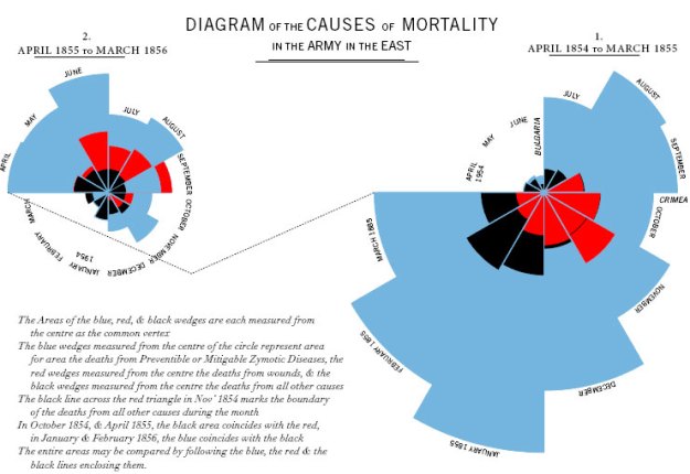
Florence Nightingale and Crimean War deaths
Minard and Napoleon’s army
![Minard's Napoleon army diagram]()
Jon Snow’s cholera map


Minard and Nightingale both manage to tell tragedies in a chart, but where Nightingale challenges an assumption, Minard’s is an actual narrative. Put another way: Nightingale performs the journalist’s role of telling truth to power; Minard tells a cracking story. Both are more effective than mere words would be.
Snow’s map doesn’t tell a story anywhere near as clearly, but it’s the story behind and around it that matters. The map actually played a marginal role in Snow’s data journalism, and the more interesting aspect is how shoe leather and a sort of ‘citizen journalism’ or ‘citizen science’ (a local priest) played a much larger role. Steven Johnson’s The Ghost Map tells the story.
Data on the front page (The Guardian, Llloyds List)


Many newspapers printed tables prominently in the 19th century. Why in the canon? It serves to remind us that we’re not quite as innovative as we think we are.
The Detroit Riots and Philip Meyer

The birth of modern data journalism comes with ‘Computer Assisted Reporting’ (CAR) and particularly the work of Philip Meyer from the late 1960s on.
Meyer applied social science methods to journalism in order to test claims about the reasons for massive civil disturbance and with his book Precision Journalism inspired a generation of journalists in the US and beyond.
It also provided the inspiration for another potentially canonical piece of data journalism 45 years later: Reading the Riots, which saw a similar partnership of news organisation (The Guardian) with academic researchers (LSE). You can read the LSE study here (PDF).
Mashing and mapping: ChicagoCrime.org

Adrian Holovaty was the Meyer of the 2000s. Taking crime data published by Chicago police, and ‘mashing’ (combining) it with Google Maps, he made it possible for any user to check out crime patterns in any area. Like Meyer, it inspired a generation.
What made this different to the CAR that went before was two things: firstly, the user could choose where to look, not just the journalist. Secondly, the data was live and automatically updated. It didn’t sit on a reporter’s computer – or a university mainframe. It was networked.
Letting users do interesting things with your data: APIs at the BBC and beyond

What Holovaty did – combining data from more than one source – is much easier if you have an API to work with (he didn’t).
Twitter’s API, for example, allows you to ‘fetch’ the latest tweets from your friends, or around a particular location or hashtag. Google Maps’ API allows you to ‘fetch’ a map around a particular location, and place markers or routes on it. You can combine the two to fetch tweets and place them on a map.
In 2009 the New York Times and Guardian both attracted a lot of attention when they launched APIs which allowed anyone with coding knowledge to build applications with their data (articles, but also political information) and do interesting things, helping drive new traffic to neglected archive material and helping test the market for mobile apps.
But 4 years earlier the BBC had been opening up its own content in a similar way with the Backstage project. It influenced Adrian Holovaty to set up something similar at The Washington Post – PostRemix.
APIs are likely to be increasingly important in connecting stories with readers through social media. Witness ProPublica’s use of the Facebook API, for example to create a news app around education data, or PBS Frontline’s use of ProPublica’s Forensics API to map death investigations.
Animated data: Gapminder and Hans Rosling
Rosling’s TED video from 2007 accrued so many views online that the BBC commissioned him to recreate it for a TV series on statistics. It proved that numbers and charts could attract a mass audience – but it also proves that you sometimes need a narrator to make a story.
Rosling is a master storyteller, and without him the animations wouldn’t have nearly the same impact. To watch him at work is a masterclass in turning numbers into narratives.
‘Open Data’ journalism: MySociety and its children

MySociety won an award for their work on the empty homes investigation – and were nominated for two others
Before Holovaty and Rosling, and before the term open data was used by journalists, a small group of developers gathered to combine their skills to help create a more informed electorate.
Their ideas were to perform many of the roles that journalists might claim they perform:
- Providing a platform for citizens to communicate with their elected representatives (FaxYourMP/WriteToThem; FixMyStreet; ReportEmptyHomes)
- …And for representatives to communicate with citizens (HearFromYourMP);
- Making it possible for citizens to see how their representatives had voted (TheyWorkForYou) and what they stand for (Democracy Club).
- And empowering citizens to hold power to account (WhatDoTheyKnow)
You can argue all you like about applying the term ‘journalism’ to their work (they worked with Channel 4 News on the 2005 election and were nominated for an Emmy and BAFTA for their work on The Great British Property Scandal), but it has undoubtedly had both a major impact on the environment data journalists work in, and influenced data journalism publishing.
When a site like ProPublica makes tools out of its data, or the Houston Chronicle allows users to email their elected representative as part of a data-driven interactive, they are using functionality that MySociety pioneered a decade ago.
And MySociety inspired dozens of similar sites across the world, including direct clones in Ireland, Norway, Kosovo, Brazil, Spain, Hungary, Uruguay, Australia, Bosnia, the Czech Republic, Canada, Israel, Tunisia and Romania.
AskTheEU – a European-level FOI site – is based on MySociety technology. In Kenya, Mzalendo uses it to track their Parliament, in Ghana Odekro uses it too and in Nigeria, Zimbabwe and South Africa respectively ShineYourEye, Kuvakazim and the People’s Assembly website all use it too. They use their technology in the Philippines, Malaysia, and Switzerland.
In Chile they collaborated with Ciudadano Inteligente to expose MPs’ conflicts of interest. And projects like Kildare Street in Ireland, and TheyWorkForYou.co.nz in New Zealand took their cue from MySociety projects.
‘Open’ data journalism: The Guardian Datablog
I’d considered including this in the original list but held back until Simon Rogers also mentioned it in the comments. It has a good case for being included for a number of reasons: firstly, it has been widely imitated by organisations from ProPublica and La Nacion to the Texas Tribune and Wales Online.
‘Showing your sums’, as I wrote in 2009 when The Guardian launched its datablog, has become a key part of building trust in reporting.
Secondly, it proved a business point about data journalism: people spend time reading it. The last time I asked, posts on the datablog had a dwell time around four times higher than the site average (and the Texas Tribune sees a majority of its traffic coming through their databases).
Finally, however, and perhaps most importantly, it showed how to involve users in the process.
The associated Flickr pool, for example, has been a source of leads and visual treatments that otherwise wouldn’t have found a way into the organisation, while data experts like Tony Hirst and Adrian Short have contributed their skills through the datastore.
Big data: Wikileaks

Sources of Wikileaks cables. Image Source: Zero Geography
Not one story but hundreds. Wikileaks is canonical because it forced many news organisations to skill up in order to deal with the tranche of data they were getting. In many places that meant a quantitative shift from spreadsheet software to SQL databases.
It also brought specialist reporters and ‘the geeks’ together at an organisational level, each party needing the other. One piece of research even concluded that:
“WikiLeaks’ lasting impact on journalism has been on forcing the profession to confront its own definitional crisis; drawing awareness to persistent legal issues facing journalists in the digital age; and in revealing the complexity of global information flows.”
Bigger data: Offshore leaks

Image: ICIJ
Many people will argue whether Wikileaks was really ‘big data’. Offshore Leaks was 160 times bigger, far less structured, and resulted in a similar global spread of stories on the use of tax havens.
In terms of journalism it made it clear that we hadn’t seen anything yet.
Your local canon? MPs’ expenses and crowdsourcing

MPs’ expenses – image from Telegraph
I hesitate to include the MPs’ expenses scandal in this list because it is a UK-based story. It had an enormous impact on journalists’ perceptions and take up of data journalism in the UK, but I’m never sure how much impact The Telegraph’s incredible six-week period of dominance had further afield.
The Guardian’s subsequent crowdsourcing of the publicly released expenses certainly made waves (while far from the first time data had been crowdsourced), however, and perhaps it deserves a place because of that. I’d be interested in perceptions from outside the UK.
I’d also be interested in the stories you consider canonical in your own country or region. Should we include The color of money? The New York Times Dialect quiz? A data-driven media business like Skift?
Over to you.
Update 1: Canonical in Brazil? Diaros Secretos

From the comments, Träsel nominates Diários Secretos as particularly influential in Brazil. You can read more about it here (in Portuguese) and the wider impact here (in English), and there’s a YouTube channel here.
Mapping on the front page: The Times in 1806

In 1806 The Times ran a map to illustrate a murder on its front page
Suggested in the comments by Felipe Saldanha, I don’t think this qualifies as data journalism as such because there’s no structured data behind it. That said, I just like the image and the idea that mapping a news event has a 200 year-plus history.
Filed under: online journalism Tagged: Adrian Holovaty, adrian short, AskTheEU, australia, BBC Backstage, Bosnia, Brazil, chicagocrime.org, Chile, Cholera map, Ciudadano Inteligente, Coxcomb, Crimean War, czech republic, Detroit riots, Diários Secretos, Florence Nightingale, Gapminder, Guardian, Guardian Datablog, Hans Rosling, Hungary, ICIJ, Ireland, Jon Snow, Kenya, Kosovo, La Nacion, Lloyds List, LSE, Malaysia, mapping, Minard, Mzalendo, Napoleon's army, Nigeria, Norway, Offshore Leaks, philip meyer, Philippines, Precision Journalism, propublica, Reading the Riots, ShineYourEye, Spain, Steven Johnson, Texas Tribune, The Ghost Map, tony hirst, uruguay, Wales Online, Washington Post, Wikileaks


